
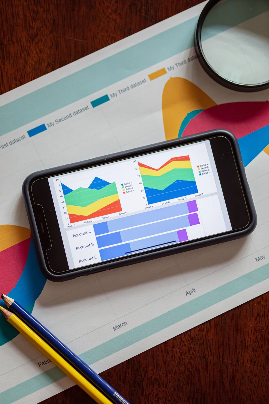
I've built a lot of attribution dashboards over the years. A good number of them stopped getting opened within two months of launch, and for a long time I assumed that was a training problem, that the team just needed better onboarding on how to read the thing. It wasn't a training problem. It was a trust problem. Nobody opens a dashboard they don't believe.
It took me an embarrassing number of launches to see it, because the death is silent. Nobody stands up in a meeting and says I don't trust this. What happens instead is quieter: someone senior asks how the dashboard's number was calculated, gets an answer with the word "modeled" in it, nods, and from that day forward asks for the raw platform exports on the side. Then a decision gets made that contradicts the dashboard and nothing bad happens, and the tool's authority is gone. Usage decays from daily to weekly to the day before the QBR, and eventually someone asks whether we're still paying for the thing. Every abandoned dashboard I've ever audited died in exactly that sequence, and the sequence never starts with confusion. It starts with a number somebody caught being wrong while the interface presented it as fact.
Why the numbers stopped deserving the confidence
Multi-touch attribution took a real hit once third-party cookies and iOS privacy changes fragmented the identity data it depends on. Identity coverage that used to sit above 90 percent now realistically runs somewhere between 30 and 60 percent, depending on your channel mix, which means most MTA setups are quietly filling in the gaps with modeled guesses and presenting the output with the same confidence as when the data was complete. The interface never changed. The decimal points are still there, the channel splits still sum neatly to 100 percent, and the visual language of precision is fully intact over a foundation that is now half inference. Teams can feel that something is off even when they can't articulate exactly what, and the result is a dashboard that gets glanced at and then ignored in favor of gut instinct, which is a terrible outcome, because the gut instinct has no identity coverage at all.
That's part of why marketing mix modeling has come roaring back after a decade of being treated as a legacy CPG tool. MMM doesn't need individual-level tracking. It works on aggregate spend and outcome data over time, which makes it far less vulnerable to the privacy changes that broke MTA. It won't tell you which specific ad drove which specific sale, but it will tell you, with real statistical grounding, whether your CTV spend is actually contributing to revenue or just sitting in the mix because it did last year. The honest architecture in 2026 is triangulation: MMM for the budget-allocation questions, what's left of MTA for in-flight directional reads, and incrementality tests as the referee when the two disagree. The IAB has been doing solid work tracking this shift industry-wide, and their research on where each model holds up is worth reading if you're rebuilding your measurement stack this year. I sit on IAB's Terms and Conditions Task Force, and the conversations happening there about measurement standards reflect exactly what I'm seeing on the client side: nobody trusts a single-model attribution setup anymore, and the smart teams are running two models in parallel rather than picking one and hoping it holds up under scrutiny.
Put the uncertainty on the dashboard
Here's my actual recommendation, and it has less to do with which model you choose than how you present the output. Every dashboard I build now includes a visible confidence indicator next to any modeled number, not just the hard, directly observed ones. If a number is estimated, I say so on the dashboard itself. A conversion count from a server-side integration is labeled observed. A channel split leaning on modeled identity is labeled estimated, with a range where the range is honest. Counterintuitively, that transparency is what gets people to trust and actually use the tool. A dashboard that admits its own uncertainty gets opened. One that presents modeled guesses with false precision gets abandoned the first time someone in the room catches it being wrong.
The mechanism is worth understanding, because it's the opposite of what most analytics teams fear. They worry that showing uncertainty undermines credibility. It's the reverse: false precision is a debt that comes due at the exact moment you can least afford it, in front of the CFO, when the confident number and reality visibly diverge. A stated range never has that moment. Finance, of all audiences, is fluent in confidence intervals; they price risk for a living. What they cannot forgive is being told a guess was a fact. The dashboards of mine that survived years of use were never the most precise ones. They were the ones that had never once been caught pretending.
The other habit worth building: every dashboard should end with a recommendation, not just a chart. I've sat through too many analytics reviews where a beautifully built report closed with "let us know if you have questions" instead of "here's what we think you should do next." Data without a point of view isn't insight. It's homework you're asking someone else to finish, and the person you're handing it to has less context than you do.
If your attribution setup hasn't been touched since before iOS privacy changes reshaped what MTA can actually see, it's worth an honest audit before you trust another quarter of decisions to it. Start with one question: does anything on the dashboard tell the reader which numbers are observed and which are modeled? If the answer is no, the dashboard is one caught error away from the silent death, whether or not anyone has caught it yet. That's usually the first conversation in a data analytics engagement here.